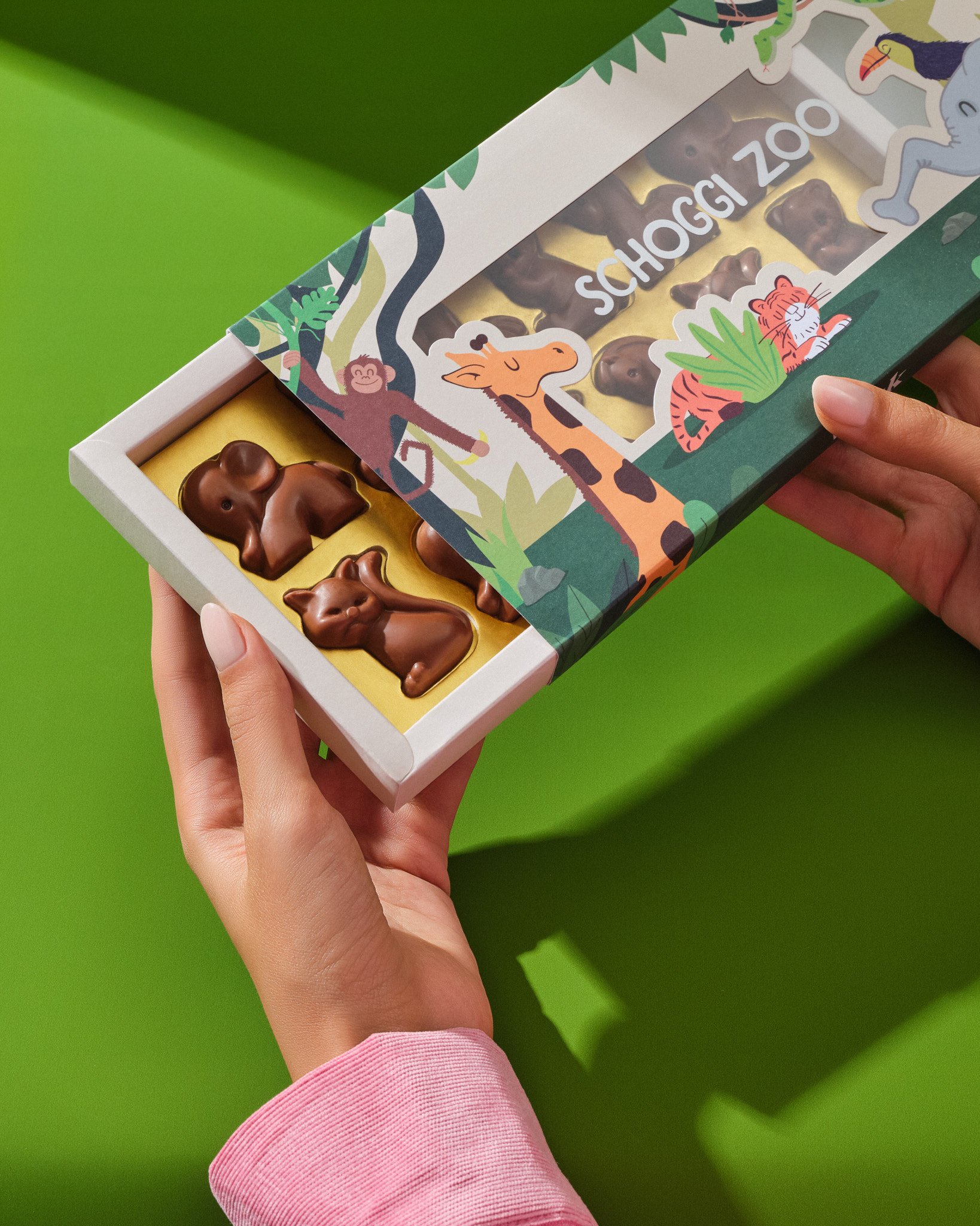
CASE STUDIES
EVERY DILARA PROJECT HAS A STORY TO TELL.
Explore Dilara's extraordinary packaging design projects in our Case Study section. Witness the fusion of artistry and ingenuity as we transform ordinary packages into unforgettable brand experiences. Discover our diverse range of projects, from luxurious product packaging to sustainable solutions, all crafted with passion and excellence.

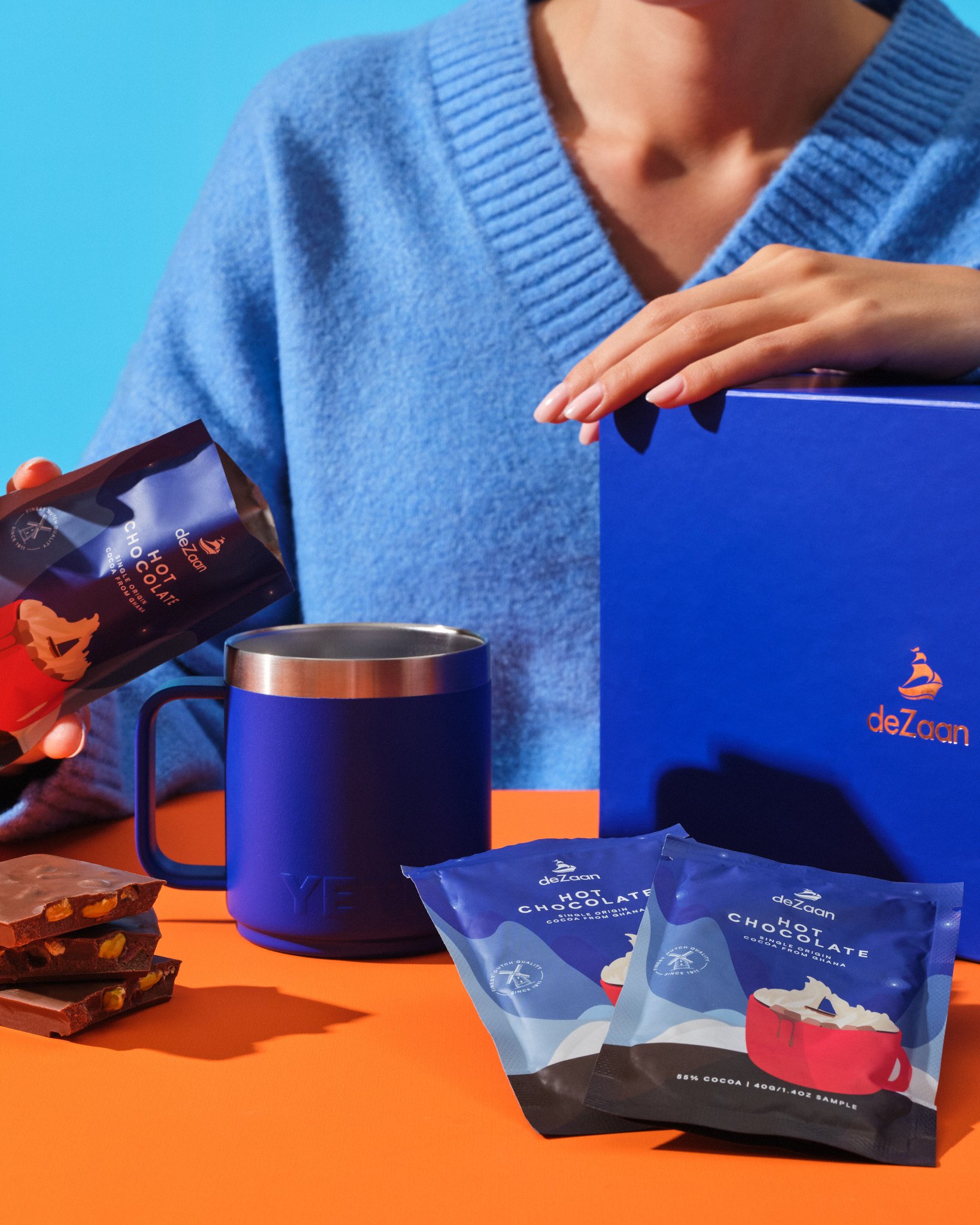
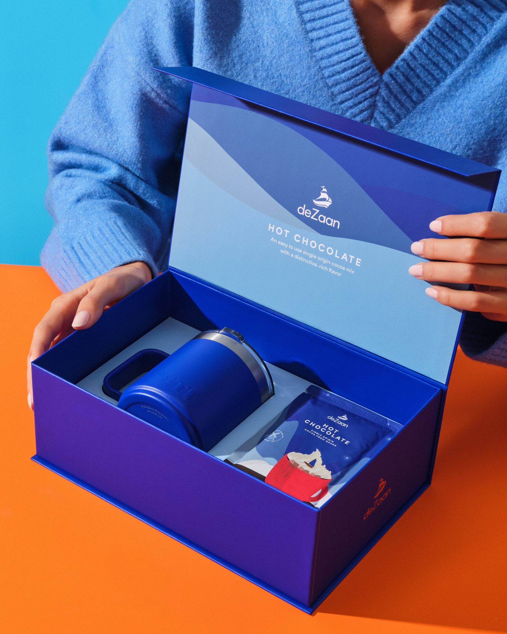
DEZAAN NEW YEAR GIFT BOX
Our client, DeZaan, wanted to send hot chocolate samples and a Yeti mug as promotional gifts to their customers for the New Year, and requested us to design a rigid box to ensure these products reach without any damage. It was stated that the box would be sent by mail, thus it needed to be extremely durable.
We have created a sturdy box using a similar structure, taking into consideration a design that reflects DeZaan's brand identity and is in harmony with its other boxes. The inlay inside the box was designed to secure the Yeti mug, and the box was made suitable for mail shipment by laminating the cardboard with the printed and embellished paper.
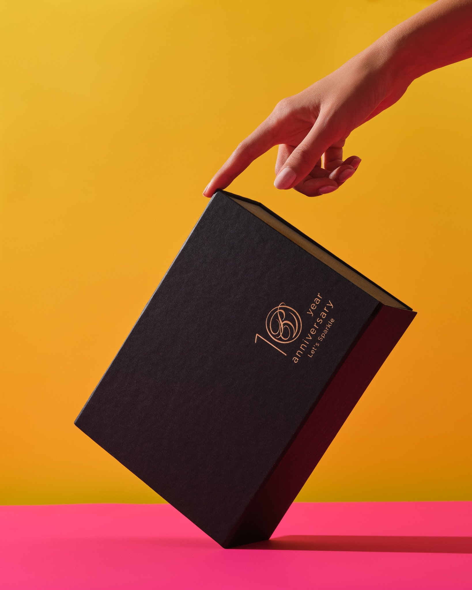
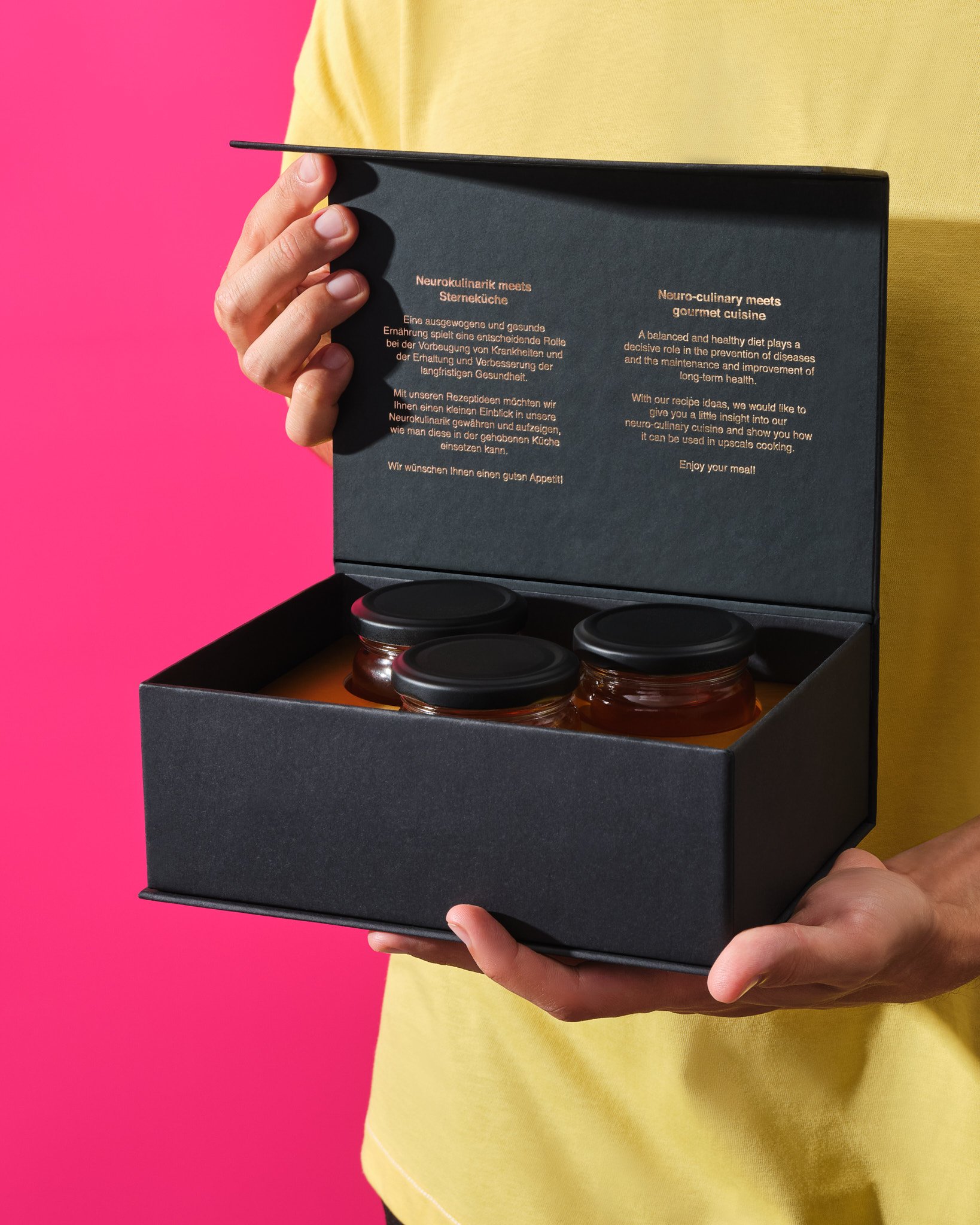
PREMIUM PACKAGING FOR PARK HOTEL VITZNAU’S 10TH YEAR CELEBRATION
Our client, Park Hotel Vitznau, requested a gift box to send to special customers in celebration of their tenth anniversary. This box would contain a bottle of champagne and three jars of honey.
In order to reflect the hotel's sophisticated image, we used special textured paper and gold hot-foil details, as we did in our previous box designs for the hotel. Due to the height differences between the products, we created a hidden elevation under the inlay, allowing the honey jars to reach the same height as the champagne bottle, thus providing a more aesthetic look. Furthermore, we secured the separator to the base and sides of the box to prevent any movement that could occur during postal delivery.
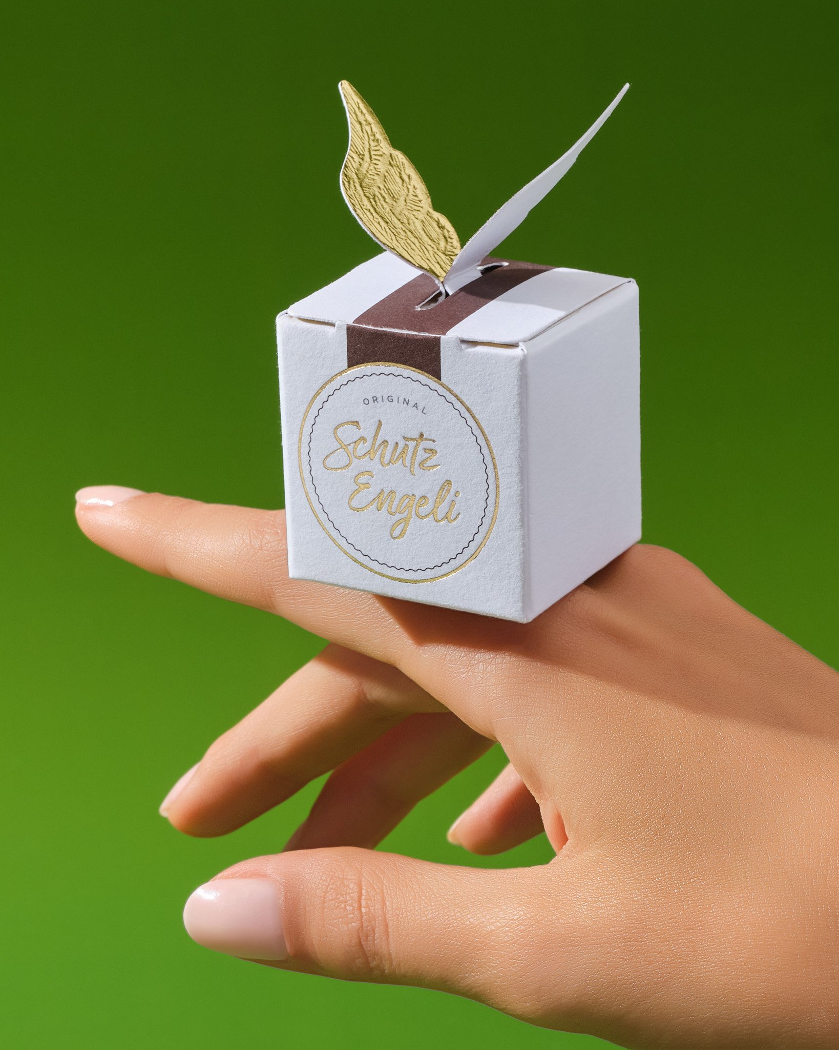
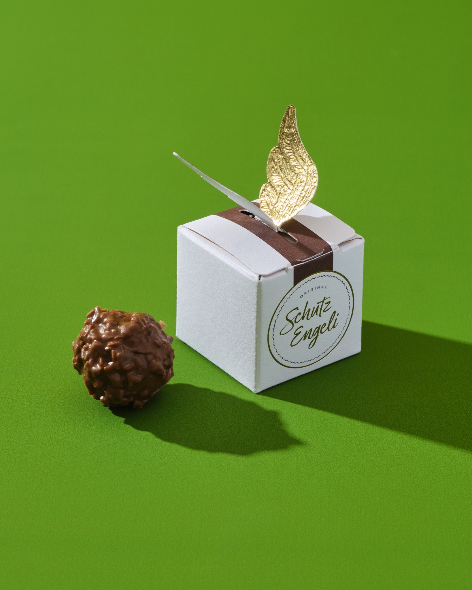
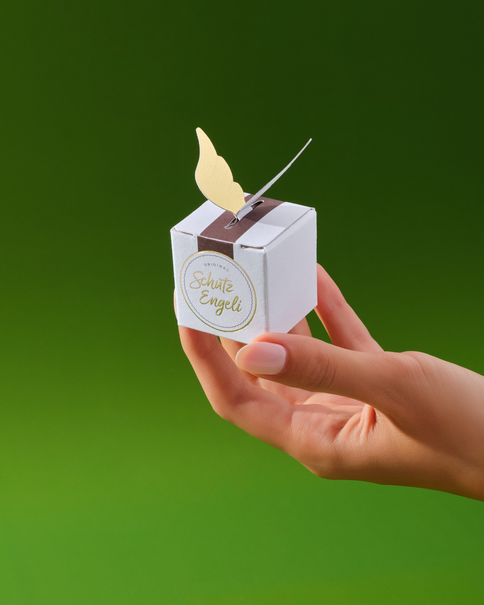
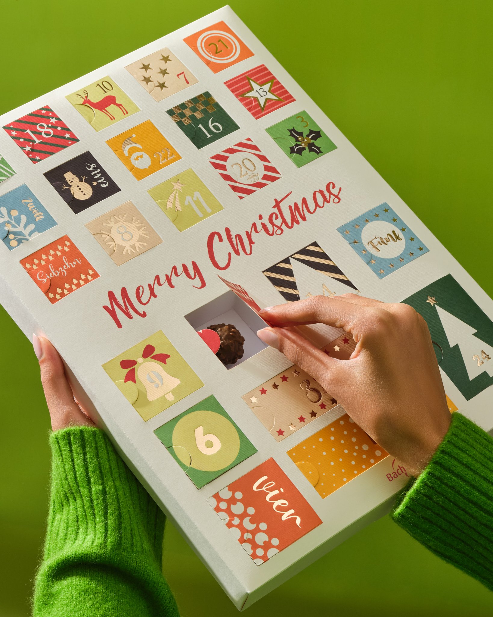
BACHMANN SCHUTZENGELI PACKAGING
Our client Bachmann requested us to design a box for a single truffle chocolate for their renowned product, the golden-winged Schutzengeli chocolates.
The client wanted these iconic wings to be prominently displayed on the outside of the box, while also seeking an affordable solution. Instead of manufacturing the wings separately and attaching them to the box later, we extended the same paper to serve both as a stabilizer for the box lid and as an affordable solution. This method resulted in both aesthetic and functional outcomes.
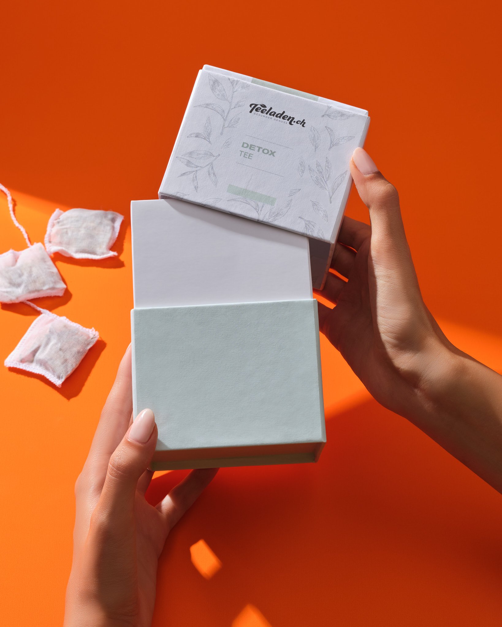
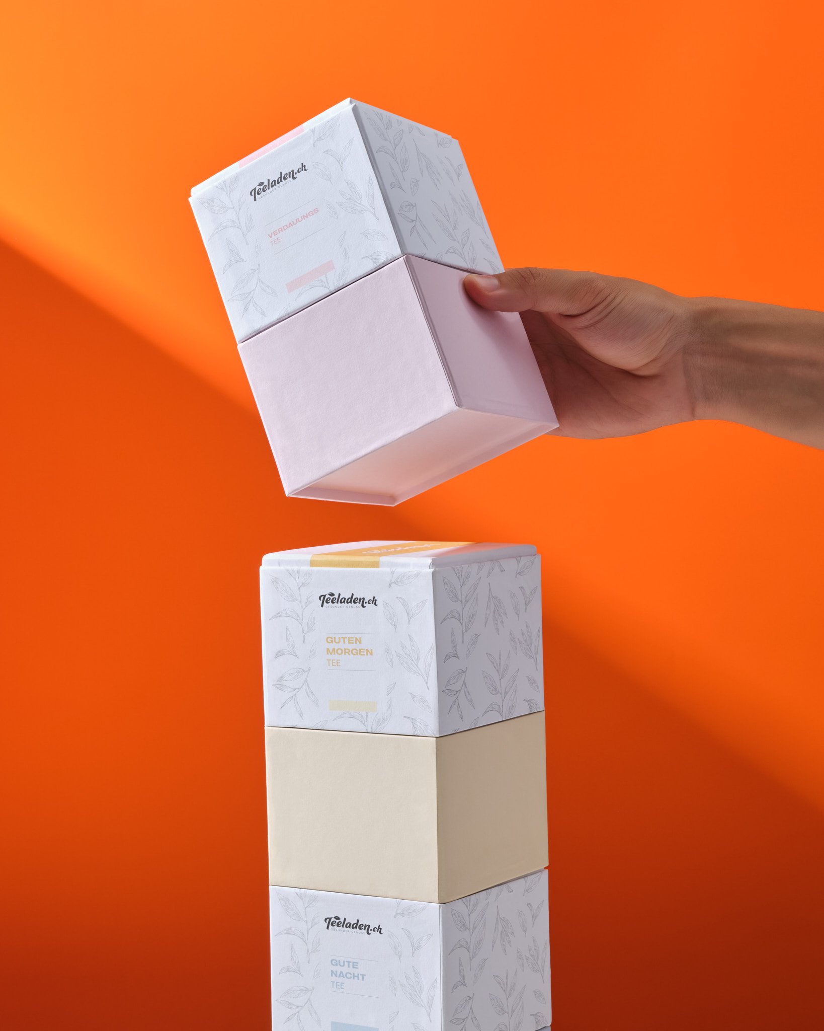
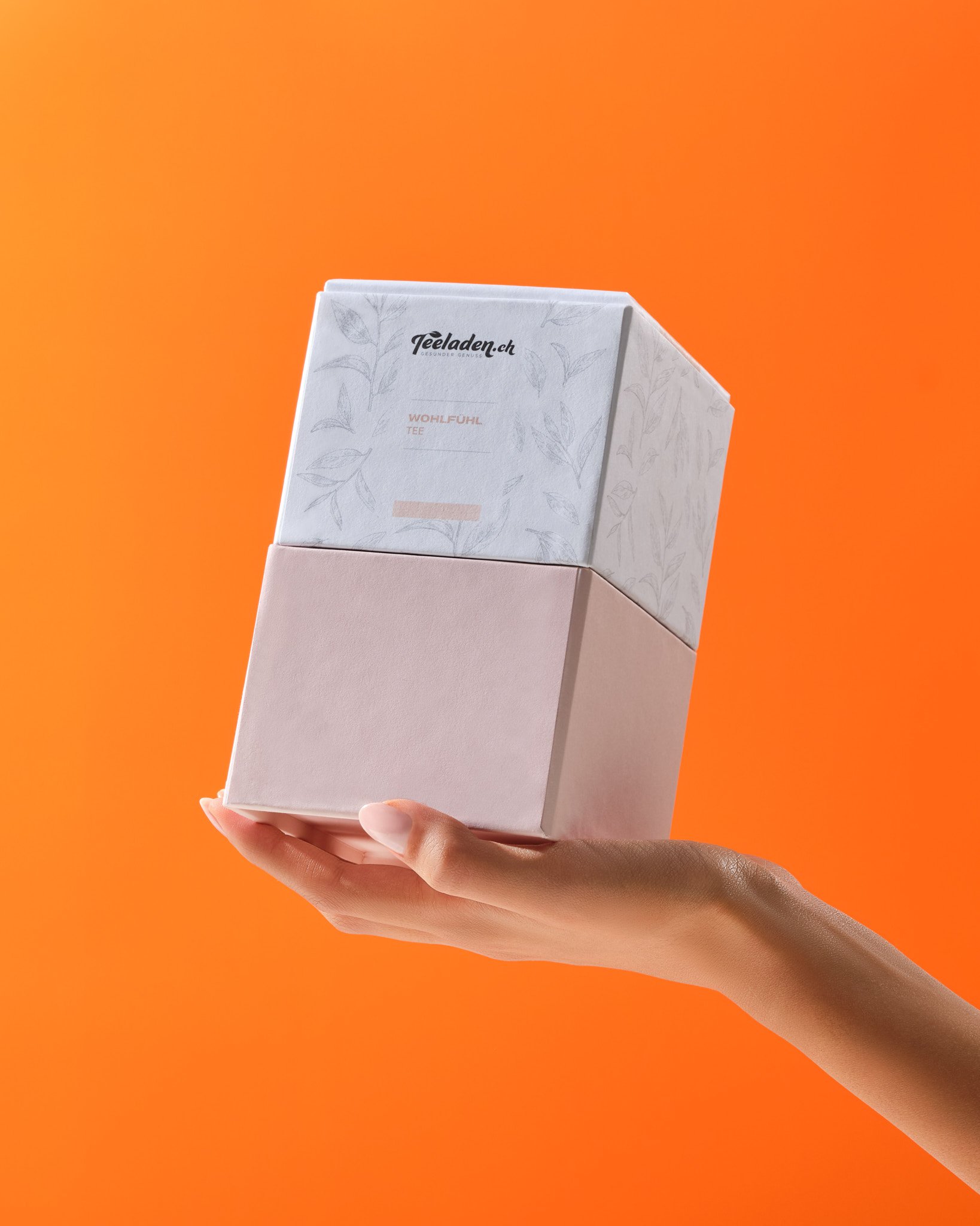
TEELADEN SPECIAL TEA COLLECTION PACKAGING
Our client TeeLaden requested packaging for which we would undertake both artwork and structural design for their six different organic and special tea varieties that are ready to be launched on the market. As our client aims to differentiate from their competitors during display and simplify their logistic processes, we designed the boxes in a structure that can be stacked like Legos.
To reflect the minimalist and natural image of the brand on the products, we used a tea leaf pattern in neutral grey, while we used different pastel colors to highlight the features of each tea variety, representing its characteristics.
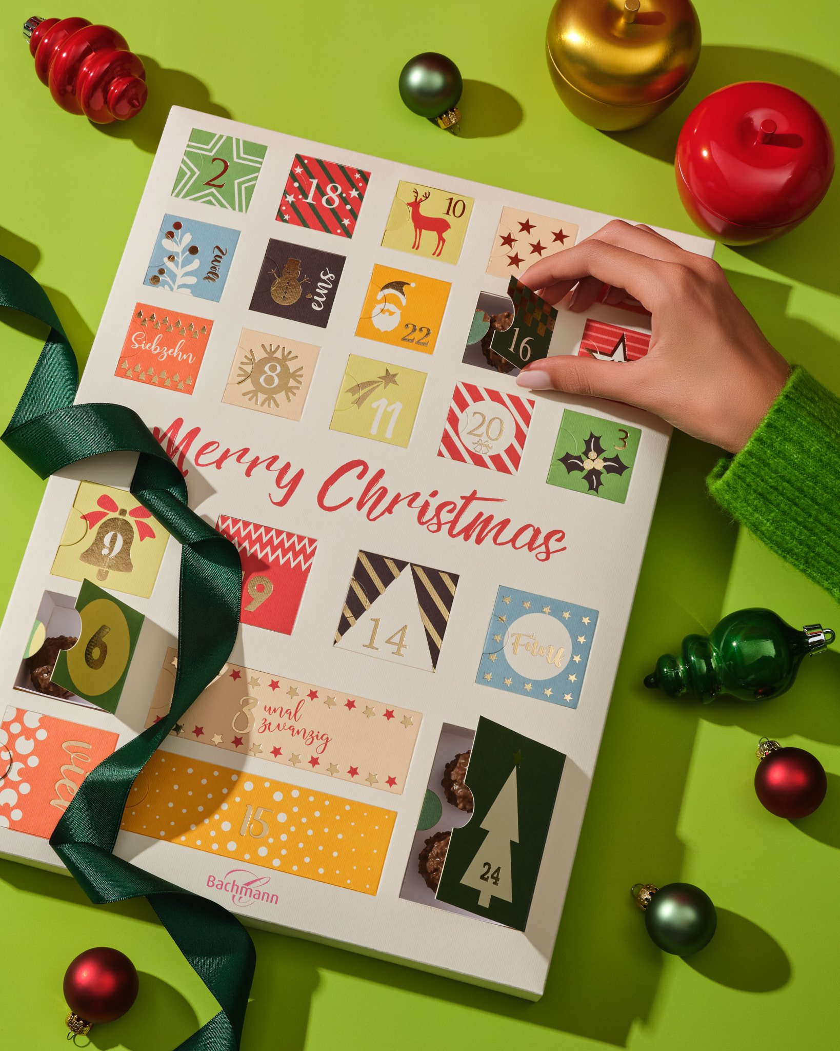
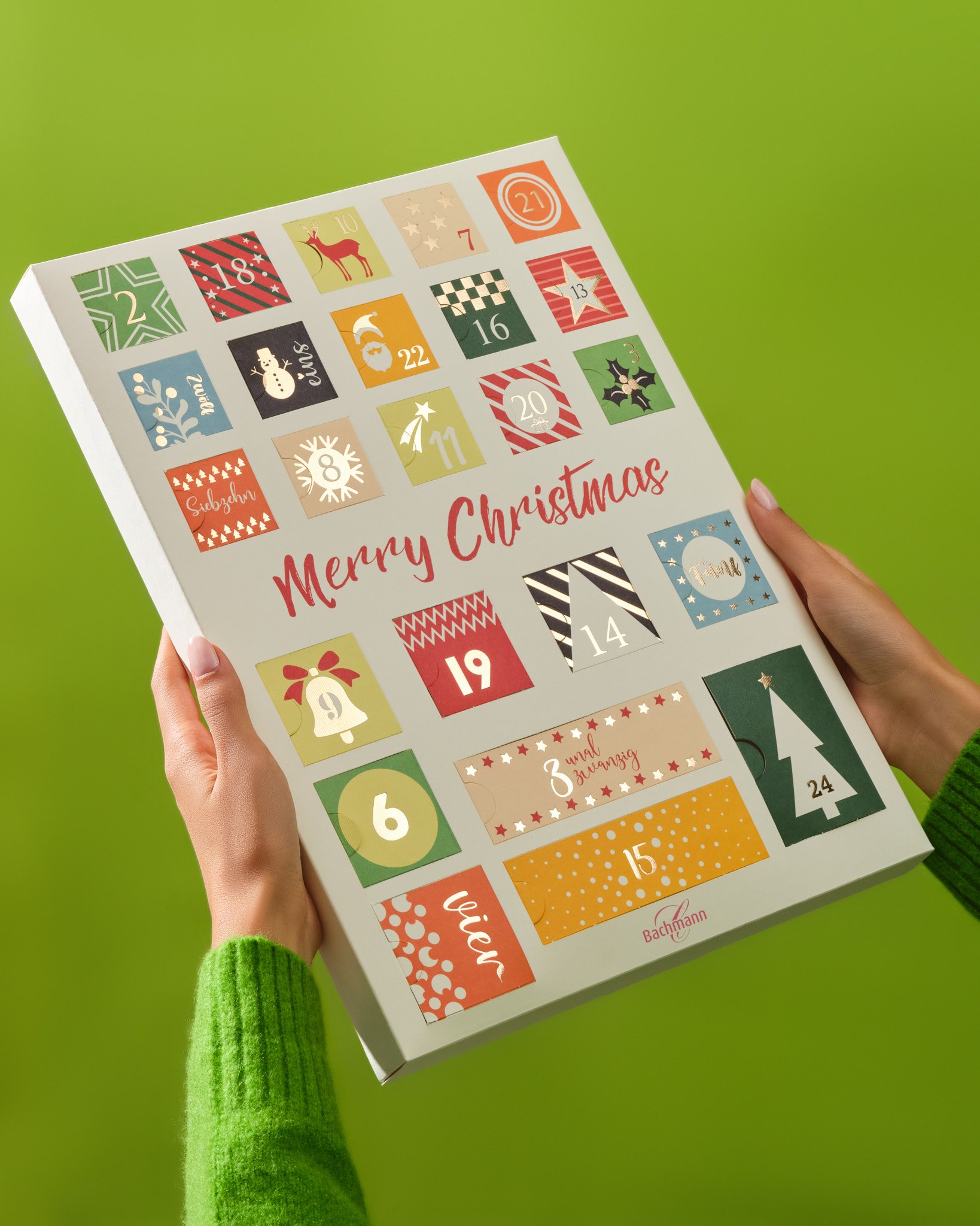

PAPER-BASED ALTERNATIVE FOR BACHMANN’S ADVENT CALENDAR
In a market where plastic inlays are typically used in Advent Calendar-style boxes, our client Bachmann wanted to avoid plastic and requested a paper-based alternative from us. Based on this possibility, we designed special paper inlays for these boxes. With this approach, we managed to reduce the use of plastic and provided our client with a different presentation and sales option.
Now, not being dependent on standard inlay sizes and shapes, our customers could freely place their products of different sizes, shapes, and varieties in each section of their boxes. In this way, we helped them present their Advent Calendars in a more diverse format.
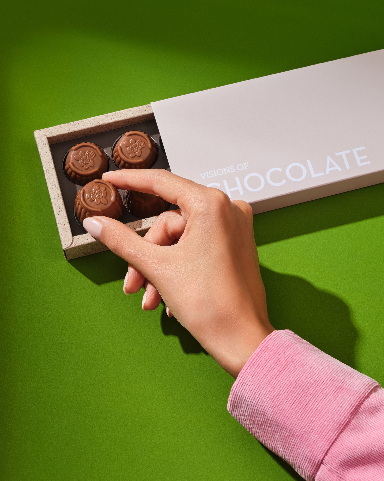
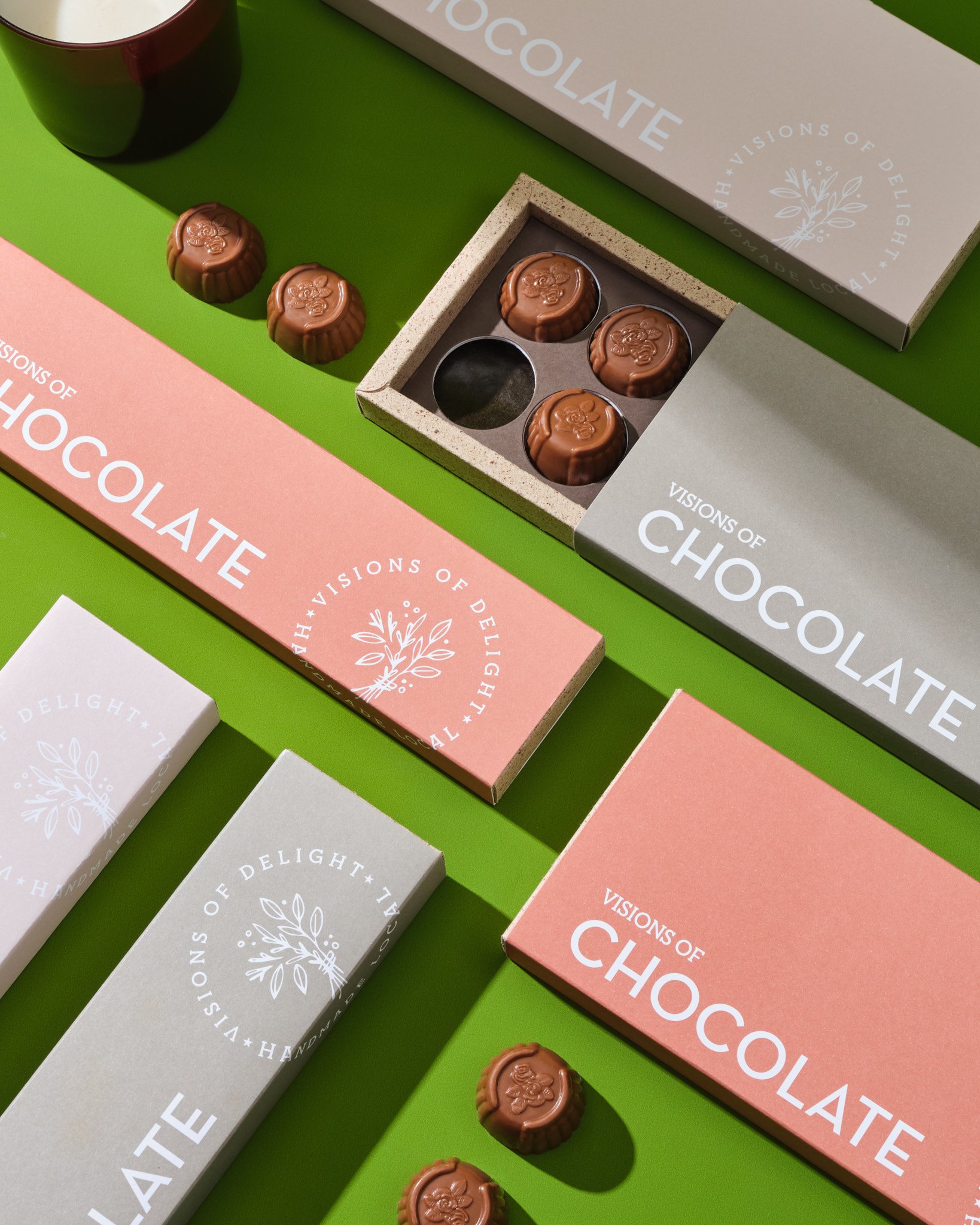
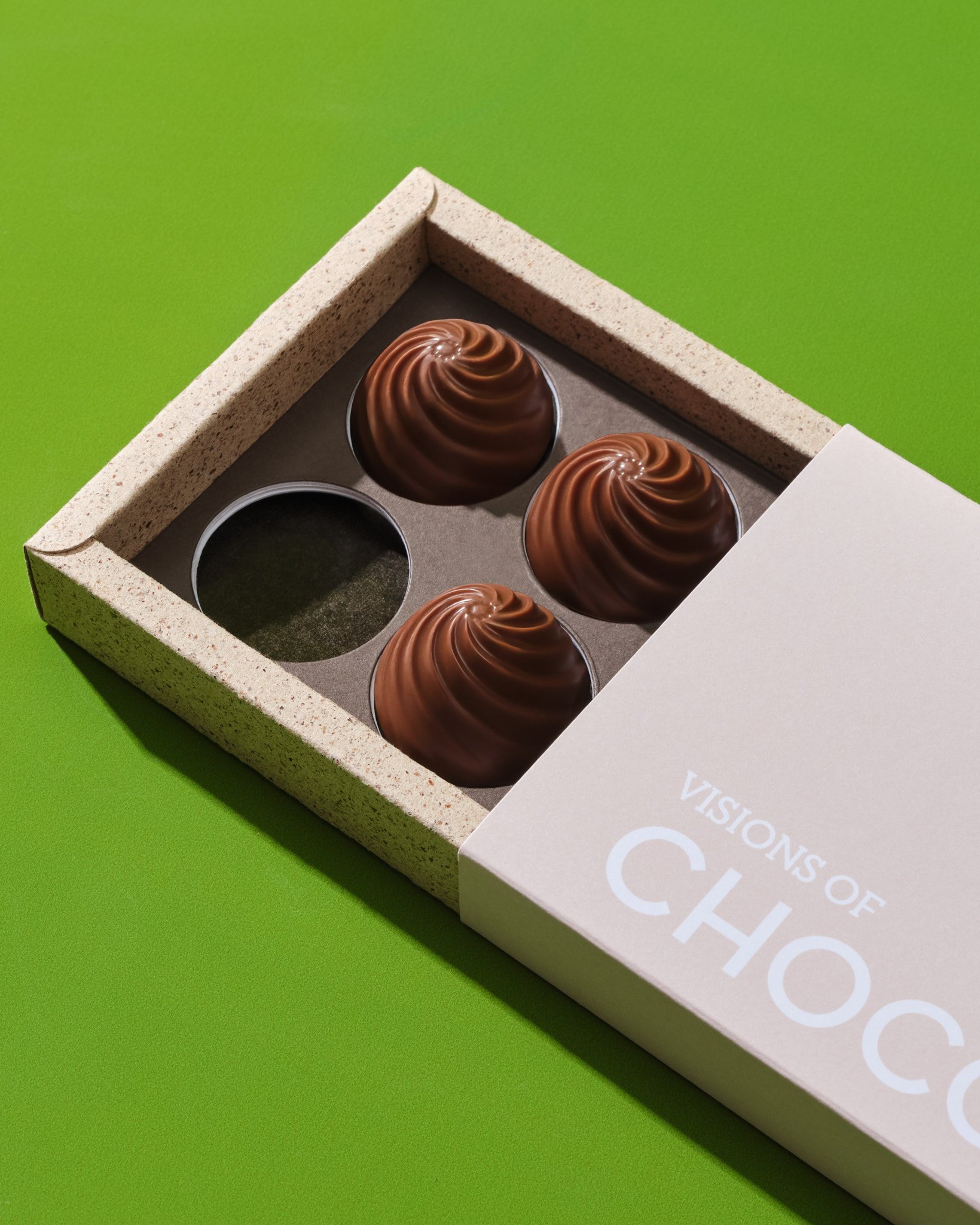
ETHICAL, ORIGINAL, BOUTIQUE. VISIONS OF DELIGHT.
We conducted a concept study for Visions of Delight, a new producer that manufactures ethical, original, boutique, and handmade products, where their brand and stories are reflected on their product packaging. Among the products created by us, this box stood out in terms of both craftsmanship and design. In their brief, they specified that they wanted to sustain their vision for praline boxes without using plastic.
In response to this request, we created a tray from cocoa papers derived from recycled cocoa beans, which provide a unique texture and appearance. For the outer surfaces of the box, we used Munken papers, completely eliminating the need for cellophane with the use of these papers.
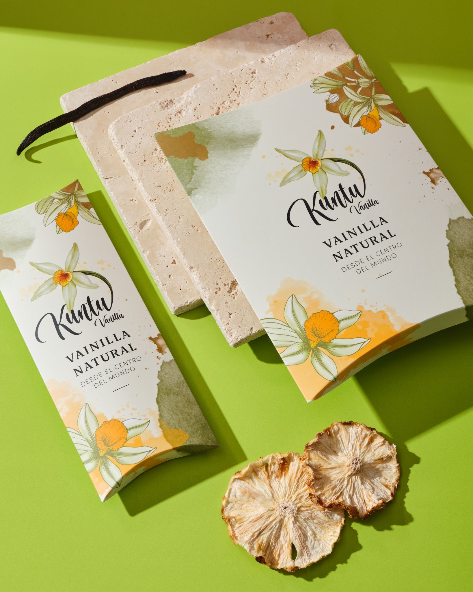
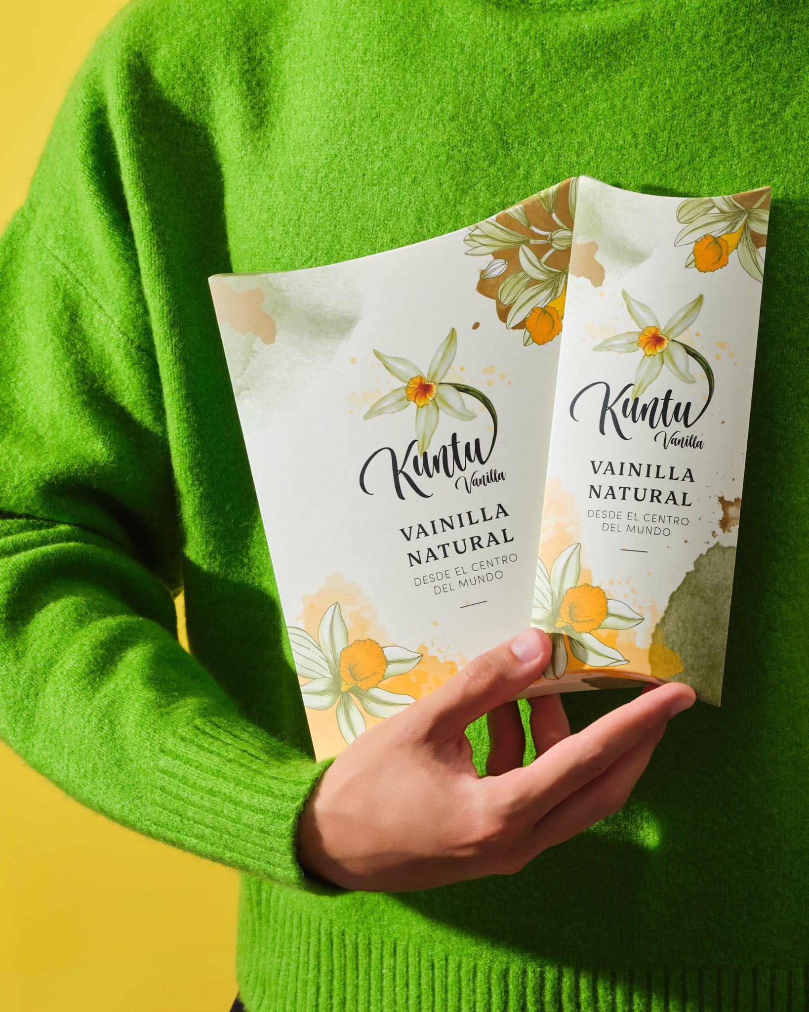
VANILLA PACKAGING FOR KUNTU
Our client Kuntu Vanilla, who recently started both retail and bulk vanilla pod sales, requested us to do structure and artwork design. Our design team used a color palette in pastel tones and watercolor effects to create a design suitable for customers in both B2B and B2C markets.
Due to the client's limited storage space, the boxes needed to be able to be sent in a flat form. At the same time, we aimed to differentiate from other vanilla packaging on the market. Therefore, by choosing a structure never used before in vanilla pods, we aimed for the box to stand out among other vanillas on the market shelves.
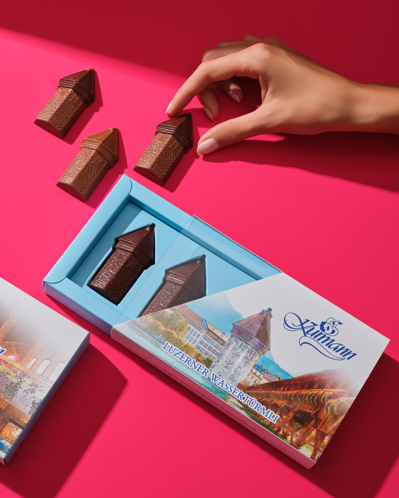
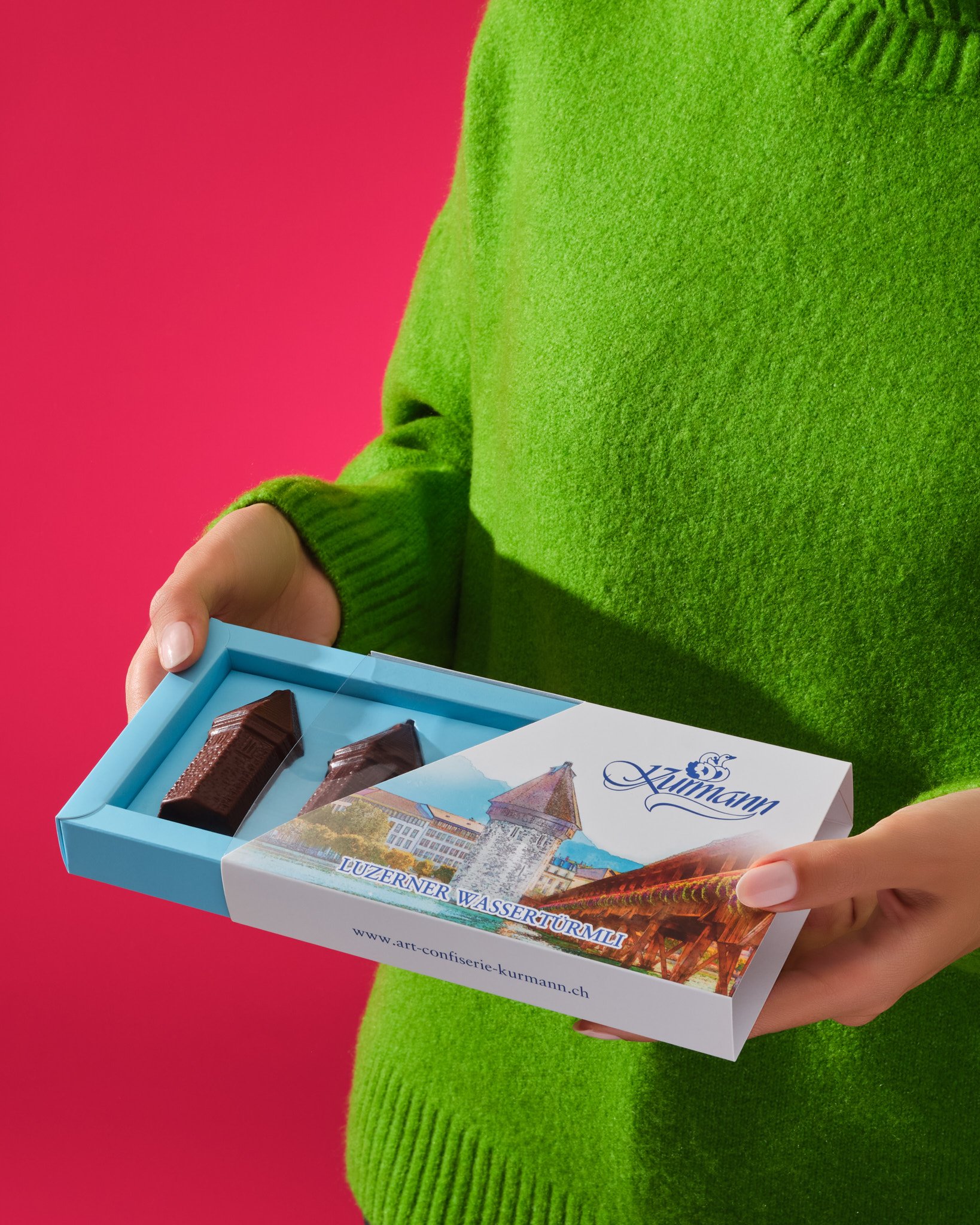
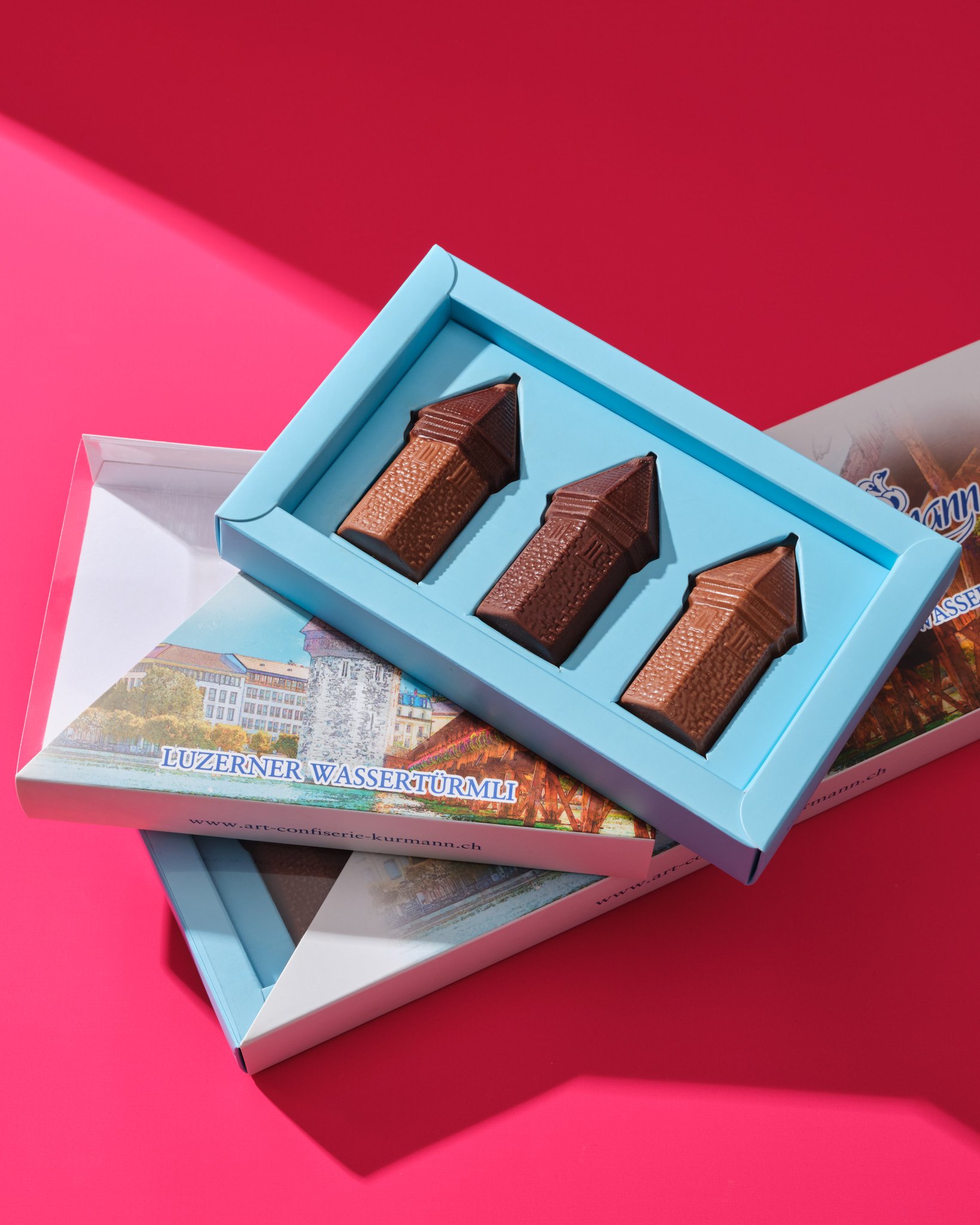
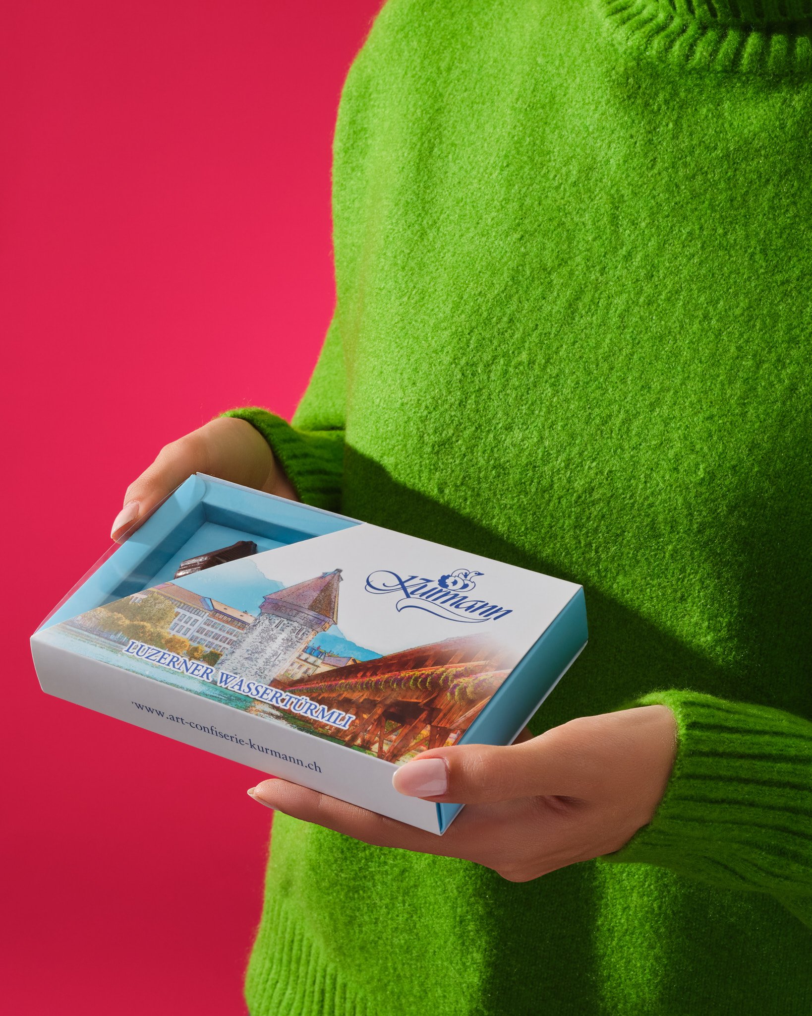
A NOSTALGIC TOUCH TO KURMANN’S PACKAGING
Our client Kurmann, located right across the iconic landmarks of the city of Lucerne, the Chapel Bridge and the Water Tower, and whose products are integrated with this symbolic structure, requested a new structural design and artwork design for their iconic Water Tower-shaped chocolates. We added a semi-transparent sleeve to the separator we designed with cut-out forms that fit perfectly to the shapes of the chocolates.
The store is located in an area with heavy tourist traffic, and we wanted these iconic chocolates to be visible. We reflected the blue of the city at the bottom of the box, and on the lid, we illustrated a watercolor scene of the Chapel Bridge and the Water Tower. In this way, we aimed to reflect the nostalgic past of the brand.
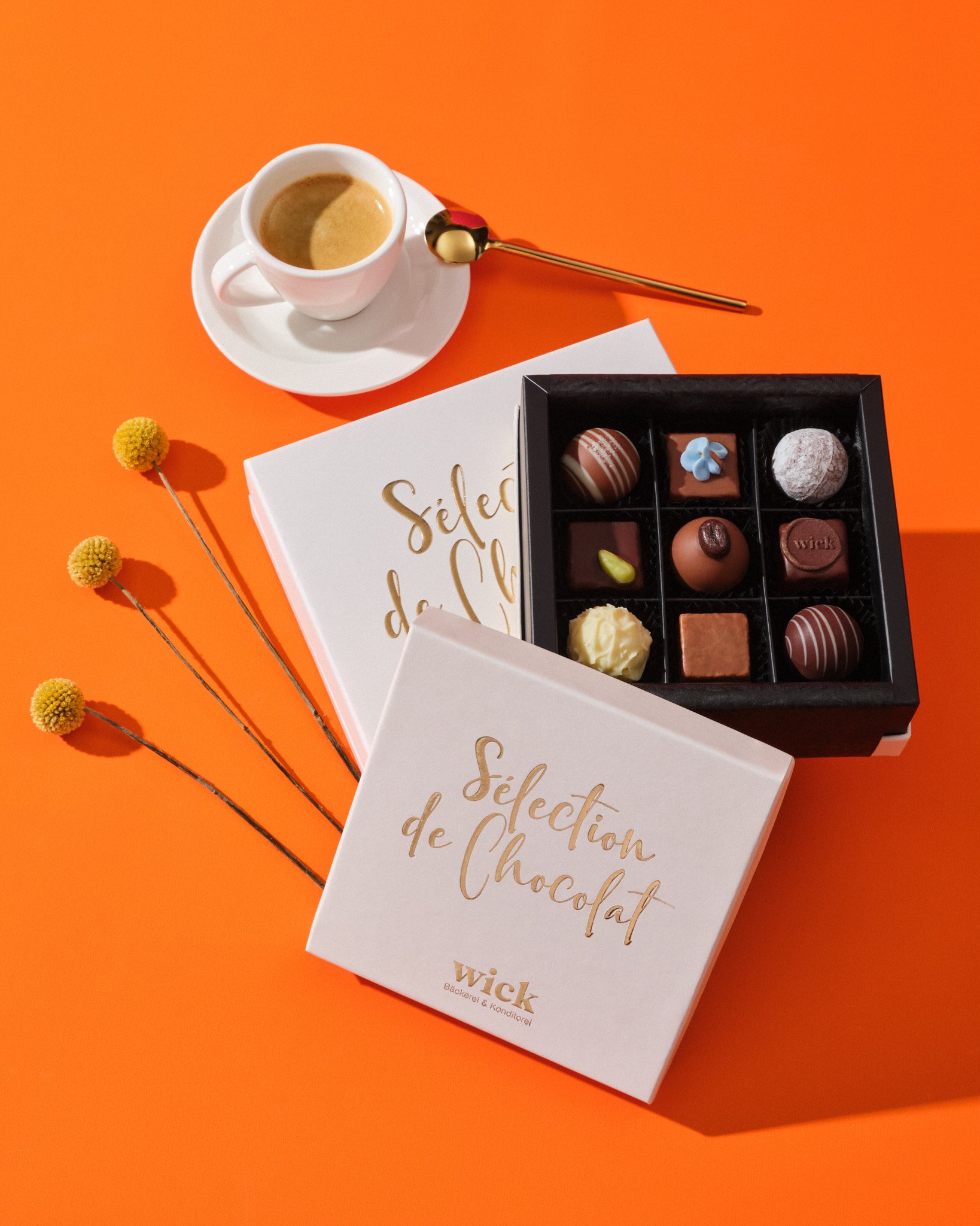
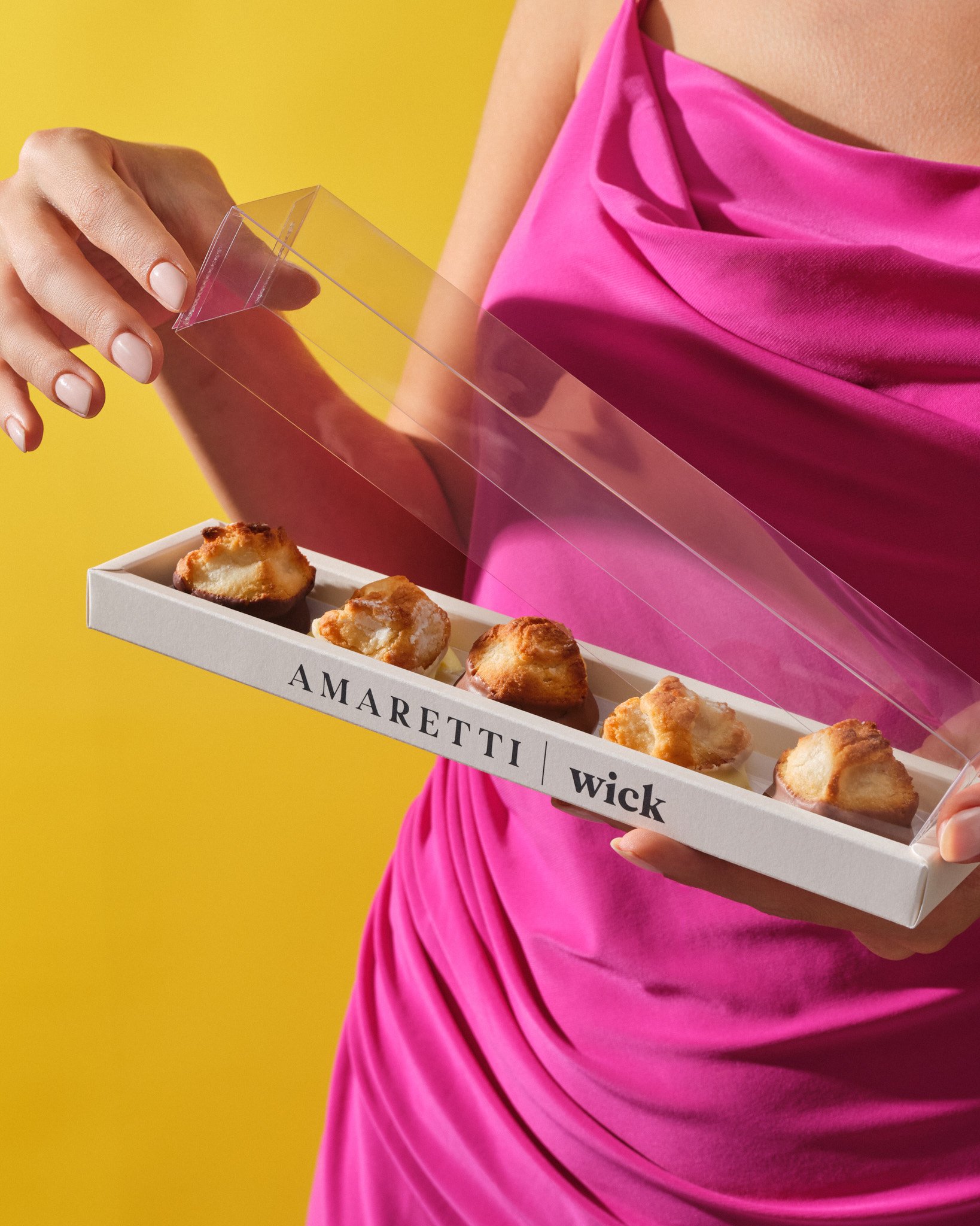

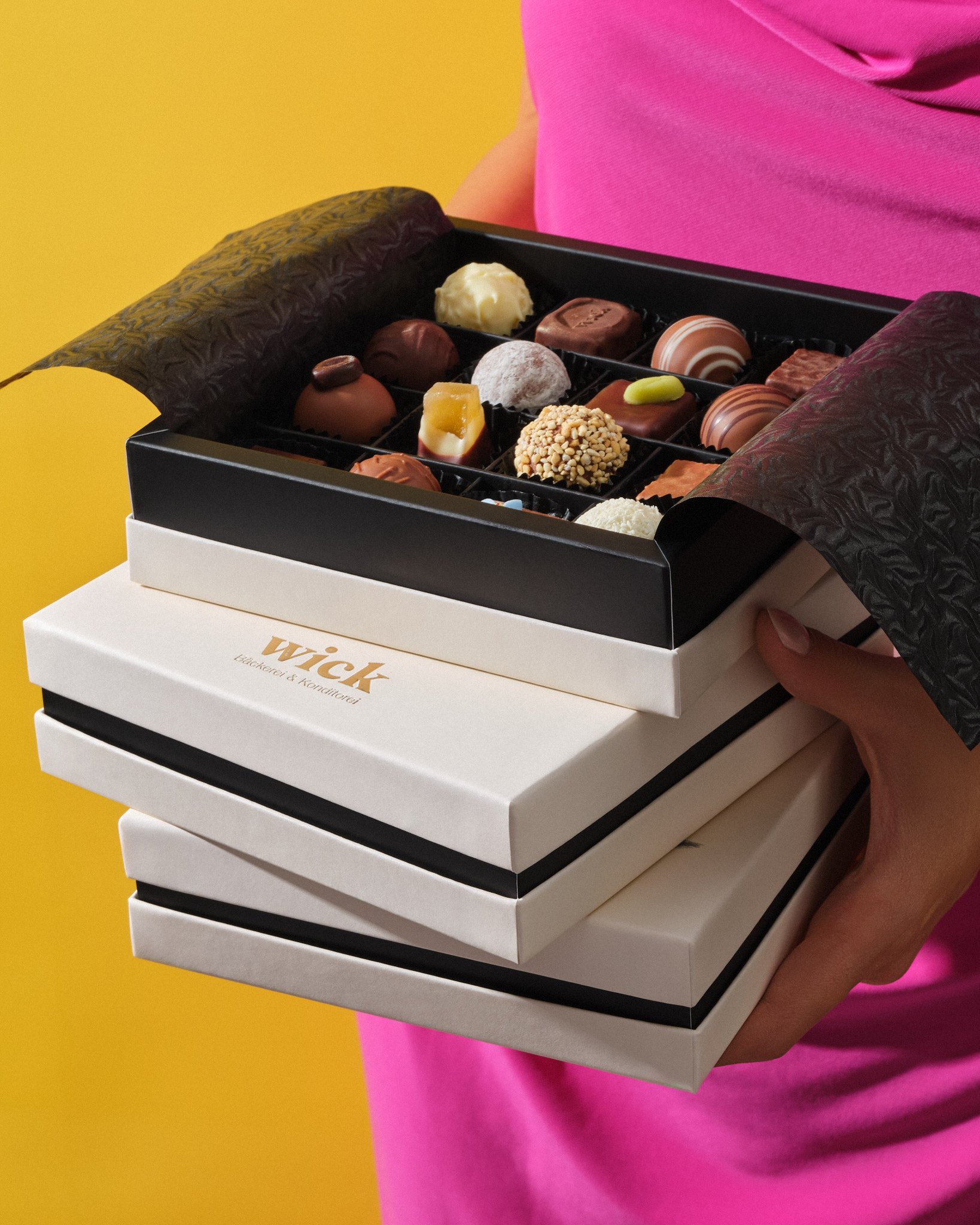
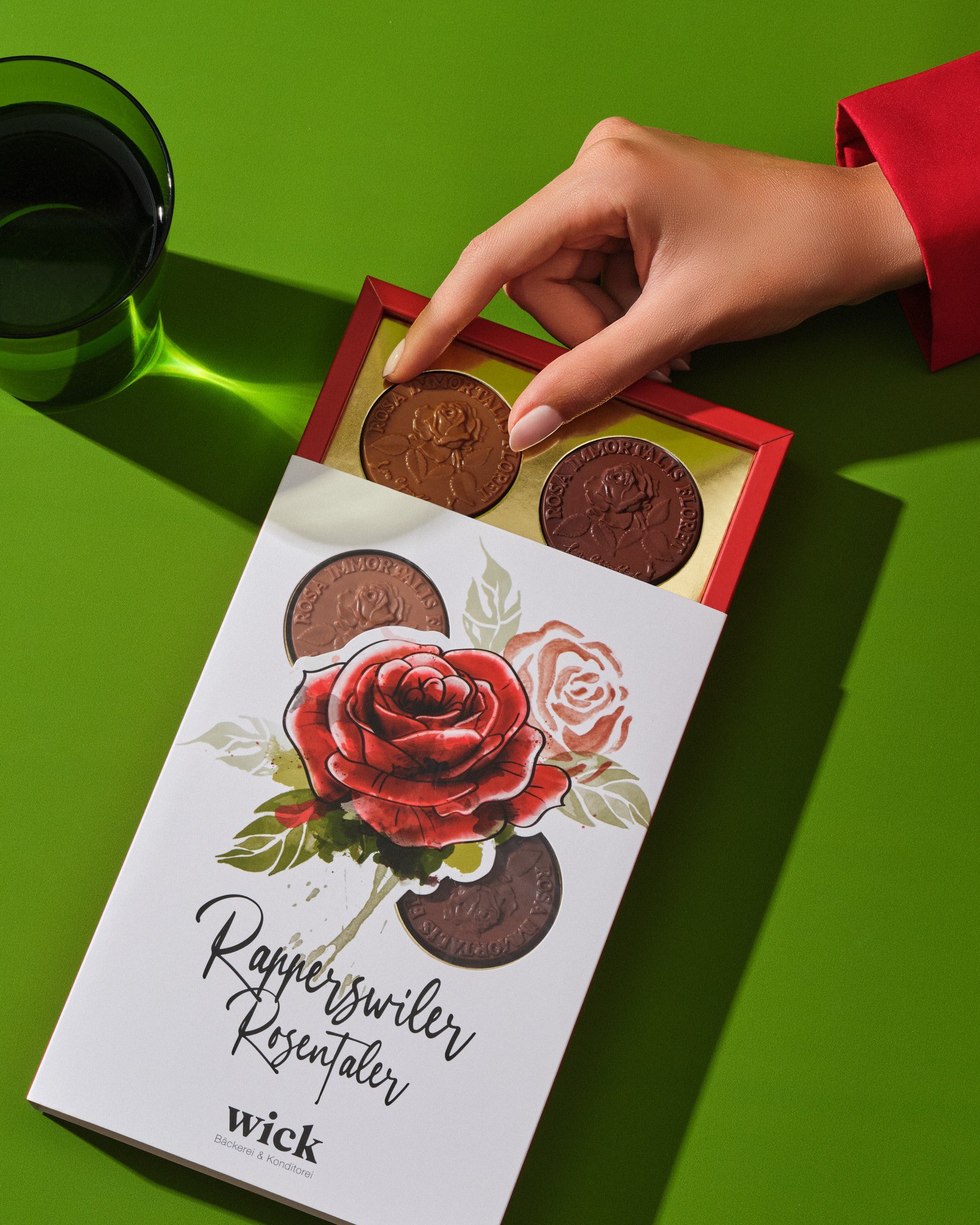
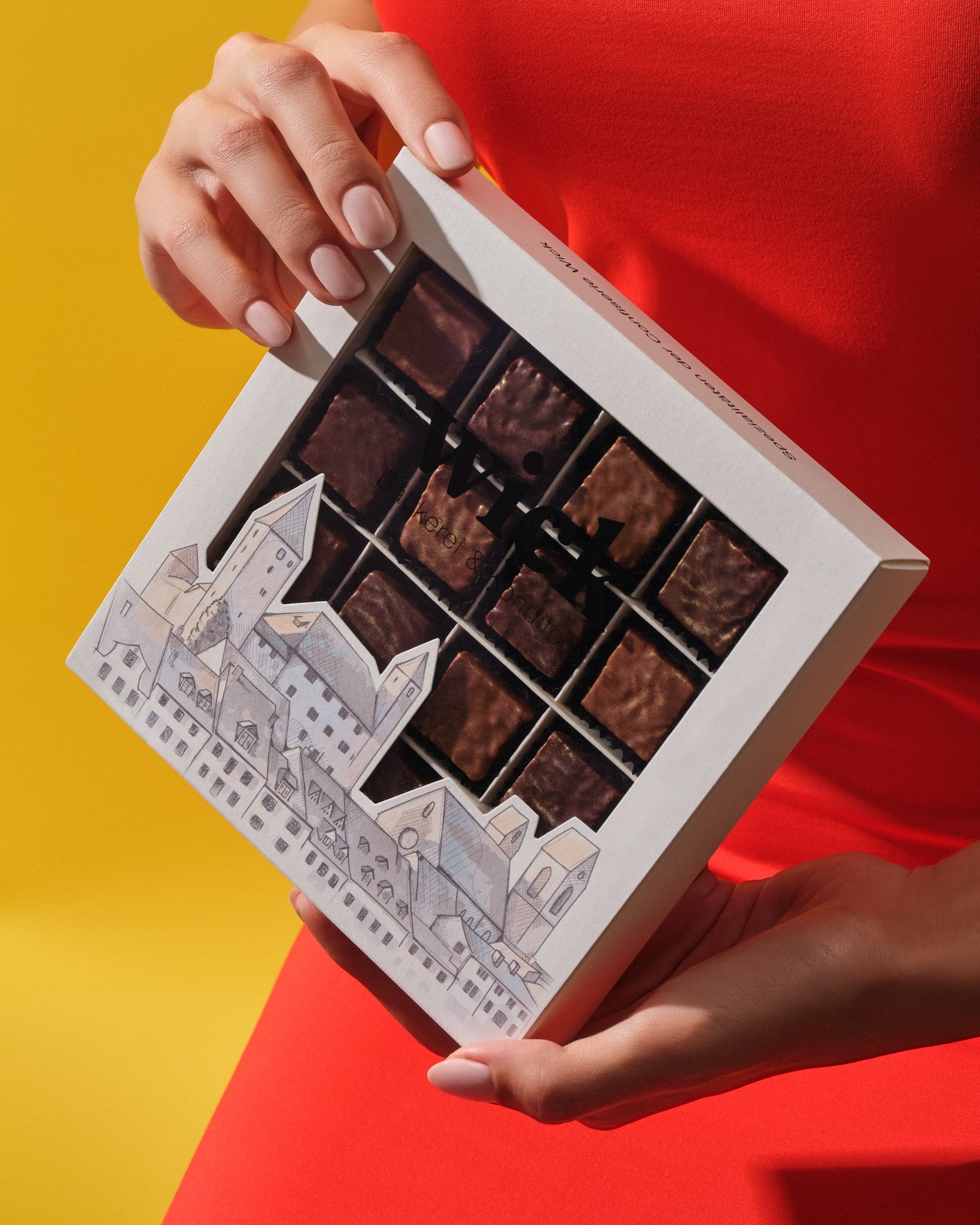

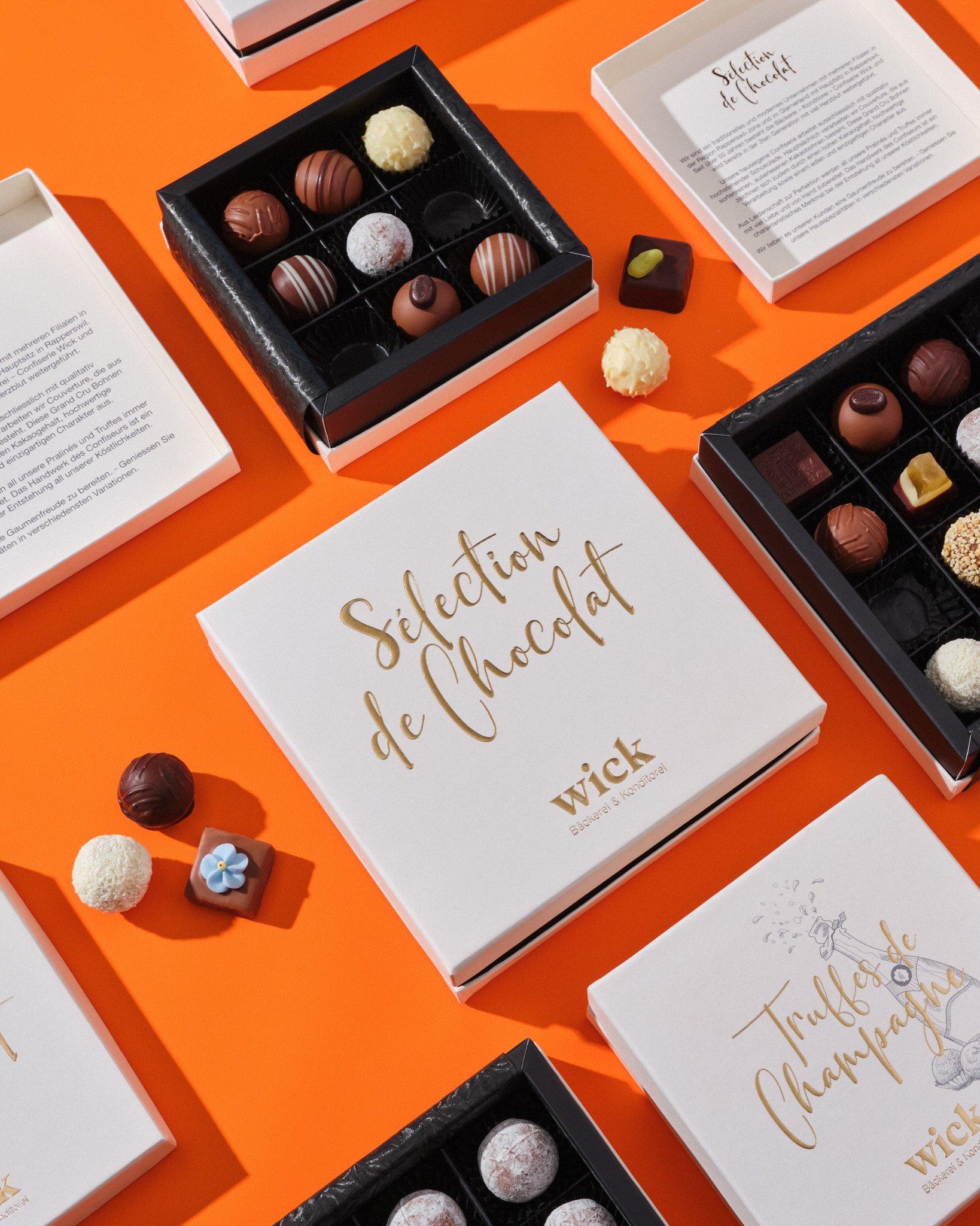
A BRAND NEW CONCEPT FOR BAECKEREI WICK
Our client Baeckerei Wick is a family business that has successfully become a chain and is integrated with the city where it is located. With the joining of the second generation to the business, they requested us to prepare a new concept for all their packaging during the process of updating their brand image.
Since all their packaging had been prepared by different manufacturers and with different visions, our priority in organizing these packages without brand unity was to clearly show that each box belongs to the same brand. For this purpose, we used the calm and monochrome colors that are prominent in their new brand identity. At the same time, to emphasize the brand's rooted past, we used the original colors in their signature products and the city silhouette associated with the brand.

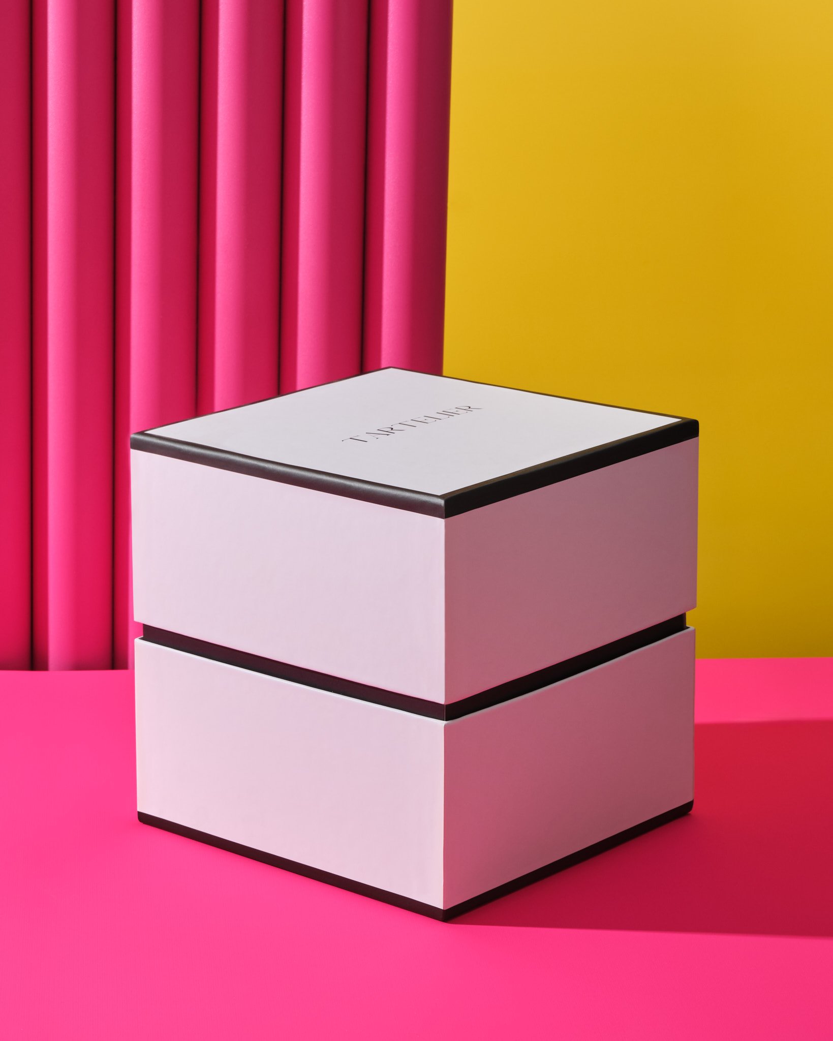
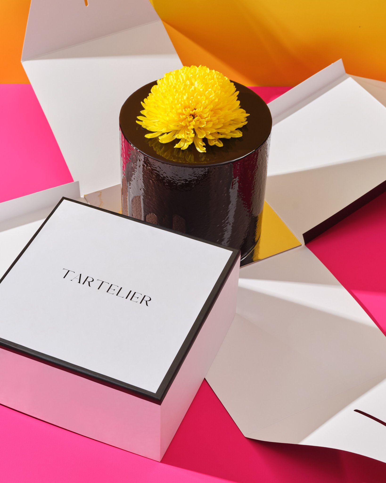
MAXIMUM PROTECTION FOR TARTELIER’S CAKES
Our client Tartelier, who makes bespoke custom cakes, asked us to design a new box to provide maximum protection during the shipment of their cakes. High-protection boxes on the market did not match our client's brand identity. Therefore, we developed a solution that would reflect our client's minimal and luxury brand identity.
By adding top and bottom covers made of cardboard around the standard cake box, we ensured that the box was suitable for logistic requirements. With the minimal design and our choice of special paper, we reflected their brand identity in these functional boxes. In this way, we designed a box that was both durable and reflected the brand's luxury and minimal style.
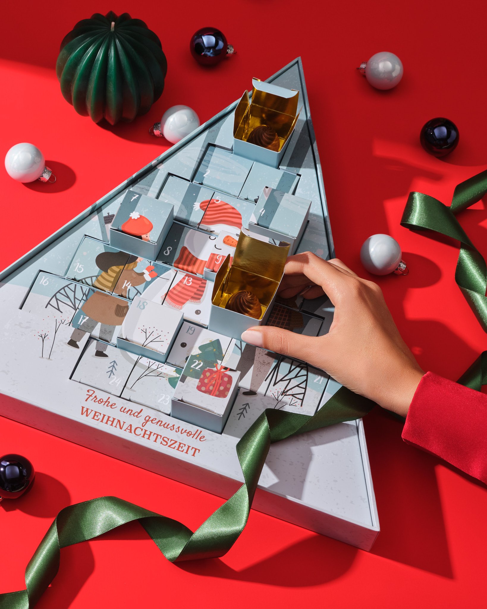
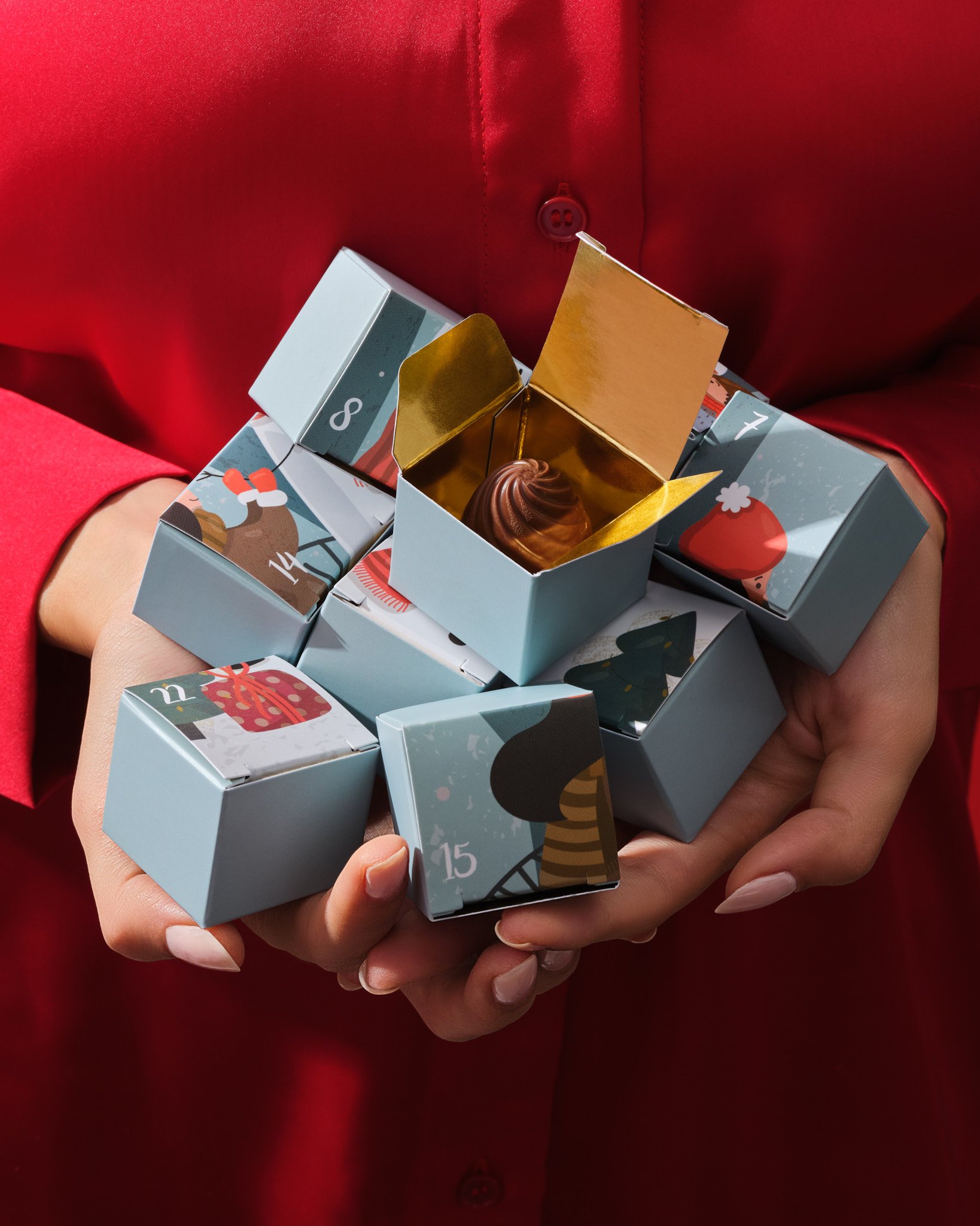
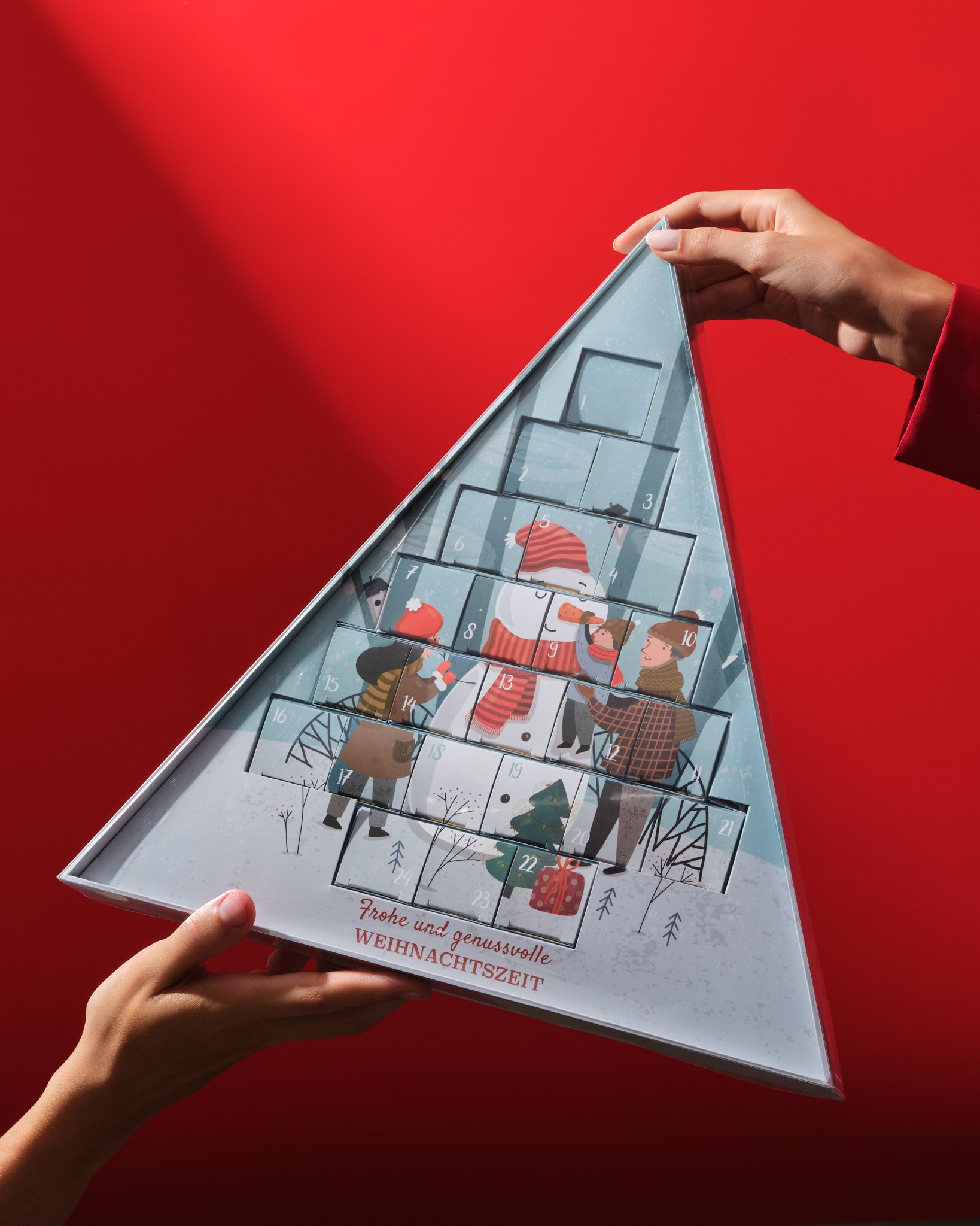
FESTIVE TRANSFORMATION FOR CONFISERIE MUTTER
We developed an original design for a sturdy, elegant Advent calendar that reflects the form of a Christmas tree, as requested by our client Confiserie Mutter for Christmas. For the sturdiness of the box, we designed a triangular base from cardboard and placed paper cubes inside this base for the Advent calendar.
With the triangular form, we aimed to reflect our client's minimal style, and also made the product stand out on the shelves. Additionally, by bringing together both modern and traditional elements in the design, we highlighted the uniqueness and quality of our client's product. This design both possesses a simple and elegant aesthetic, while also conveying the excitement and joy of the festivities.
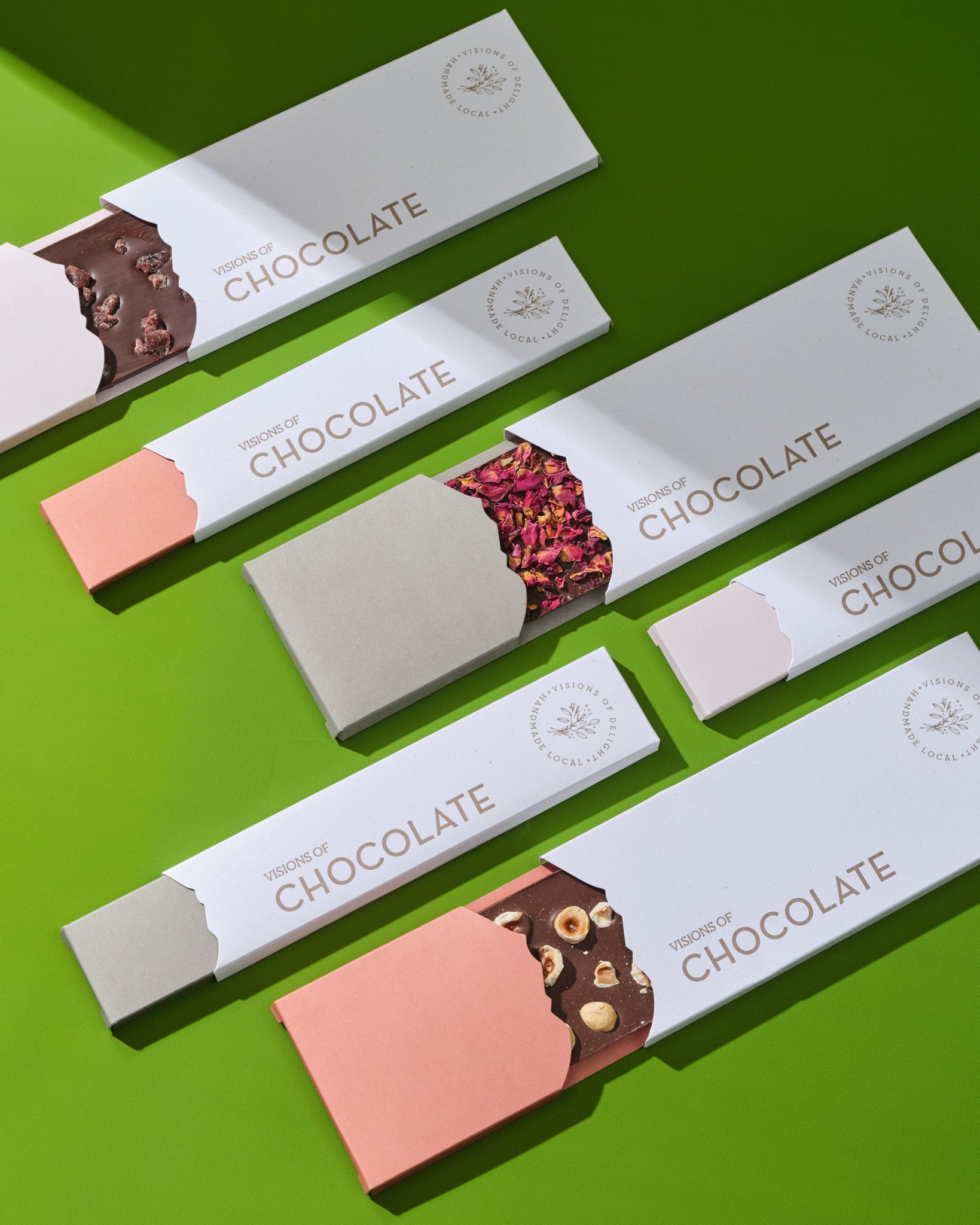
CHOCOLATE BAR PACKAGING FOR VISIONS OF DELIGHT
For our client Visions of Delight, we were asked to design a chocolate bar packaging that reflects the iconic location of their brand and their sustainable vision. In these boxes, we chose to use the silhouette of Mount Rigi, where our client draws inspiration and where their production facilities are located.
We designed the boxes using Munken paper and 100% recycled special paperboard, with no plastic inside. In their artwork designs, to emphasize the natural features of their products, we created a calm and nature-friendly color palette using muted earth tones